|
|
Post by tazimafied on Aug 14, 2013 5:56:58 GMT 1
This is kind of confusing. Proboards is actually looking good with the new update. Now would be a good time to give ours a bit of a facelift!
|
|
|
|
Post by wobblyone on Aug 14, 2013 16:42:20 GMT 1
I agree, it looks much better.
|
|
Lambourne
Excellent Contributor
   The Plucky Brit
Posts: 359
|
Post by Lambourne on Aug 14, 2013 16:46:54 GMT 1
Sounds like a plan, suggestions anyone?
|
|
|
|
Post by pershainovitsh on Aug 15, 2013 18:41:15 GMT 1
It does look good, but what happened to the New Topics button? That was one very useful button. I'll miss it.
|
|
mcguirk2
Excellent Contributor
  
Posts: 307
|
Post by mcguirk2 on Aug 15, 2013 18:44:56 GMT 1
Agreed. You can still scroll down the page and look for the red helmets. They signify new posts.
|
|
|
|
Post by psyco6 on Aug 17, 2013 20:24:49 GMT 1
Looks good.
|
|
|
|
Post by tazimafied on Aug 17, 2013 21:16:23 GMT 1
So we definitely need a new banner. Maybe something truly Spartan this time instead of the games we play but says we are gamers. If we do something with game logos it will likely need to be changed very soon with new releases coming. The folder images in front of the threads need to go! - The simple folder image can be changed to an old piece of parchment or paper.
 - The announcement could be a cut out of the screaming Spartans head everyone is using or maybe just his mouth.
 - Sticky posts could be a piece of paper with a knife stuck in it.
 - Locked threads would be an old timey lock.
 - Hot topics could be a Spartan helmet with flames in place of the plume.
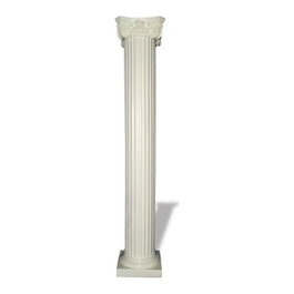
I was waiting to post until I had ideas for new and polls but those would obviously need to be changed to match the rest. Color is another thing. I was thinking deep earth colors with red highlights to go with the Spartan theme. We could also use a rock face background  or maybe some columns  or a combination of the two. I would also like to see more ideas so post up people! |
|
Lambourne
Excellent Contributor
   The Plucky Brit
Posts: 359
|
Post by Lambourne on Aug 18, 2013 12:28:41 GMT 1
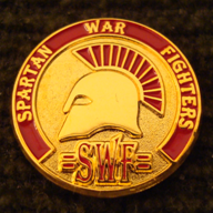
It would be nice to use this on the banner. Scriv do you still have the design saved somewhere? if so could you send it and ill create some suggestions.
UPDATED 27 JAN 2012
|
|
|
|
|
|
Post by psyco6 on Aug 18, 2013 15:20:28 GMT 1
Maybe get rid of the OCP camo pattern?
Go with Woodland or ATACS?
|
|
|
|
Post by tazimafied on Aug 23, 2013 3:52:59 GMT 1
It does look good, but what happened to the New Topics button? That was one very useful button. I'll miss it. It's there. I've seen it. Right after you log in look at the top right under the logout button. If there are new posts the 'NEW' icon will show up next to the 'Participated' link. Click on the 'NEW' icon and see all the new posts. |
|
|
|
Post by pershainovitsh on Aug 23, 2013 17:36:52 GMT 1
Once again Taz saves the day! I didn't notice that at all.
|
|
|
|
Post by sfscriv on Aug 30, 2013 6:24:05 GMT 1
.. Scriv do you still have the design saved somewhere? if so could you send it and ill create some suggestions. I am not sure what you are asking for. I have many images I have created with some of them being turned into merchandise. I do not believe there is a corresponding image with the hat/lapel pin you show in the image. Do you just want the helmet image? |
|
|
|
Post by sfscriv on Aug 30, 2013 6:43:06 GMT 1
Maybe get rid of the OCP camo pattern? Go with Woodland or ATACS? I am not a fan of the ACU digital cammo. I thought it would make our site look more current with the modern warfare cammo. The image in the background is a picture of one of my uniforms. I thought it was pretty neat to have a picture of my personal uniform as the background to the forum. We can change it. The Army Combat Uniform (ACU) camouflage uniform in my opinion was a big mistake for the U.S. Department of Defense. In the 1980s and 1990s there was a big push within the U.S. military for 'Joint' doctrine, operations, training, etc... One common unifying thing for all the services in combat in a ground conflict was the Battle Dress Uniform (BDU). The uniform came in woodland and desert versions. When we fought, the Army, Navy, Air Force, and Marines all wore the same basic uniform. The Army did some research on a better camouflage pattern, but was taking too long to decide which uniform to go with. At the same time the Marine Corps was finally getting new personalized equipment that was not already used by the Army. The Marine Corps jumped on the chance to create there own combat uniforms in the new digital pattern. The Marine Corps developed woodland and desert cammo uniforms. The Army thought they could get away with one type of uniform for all combat environments. They went with a uniform that worked pretty good for Winter, Desert, Night and even better for Urban environments. The key problem was it was horrible for woodland, jungle, and vegetated areas along the rivers of Afghanistan. So after all the huge money spent supplying the Army with one uniform, it was found to be unacceptable for the combat environment in Afghanistan and the U.S. Army opted for a uniform that looks almost exactly like the British Army uniform used in Afghanistan. So now the ACU uniform is a office uniform and the "Afghan" style cammo is used in the Afghan conflict. |
|
|
|
Post by sfscriv on Aug 30, 2013 6:47:58 GMT 1
Here is something similar that Auscam made previously with the hair out the top of the helmet is red  |
|